Devlog #33: Basecamp
I started the week continuing to chip away at the goals I set two weeks ago, and made a bit of progress before getting sidetracked (in a good way). So I instead spent most of this week reworking sprites and rooms I previously made, most significantly - the basecamp.
--------------------------------------------
Two week goals
-Controller support: Done
-Yusuke in party: Almost done!
-Ayumu/Momo/Wesley POWS: Unfinished
-North Area: Made some decent progress.
-Add audio: Almost done!
I got a decent amount finished before getting sidetracked, and overall pretty happy with what I got done in the two weeks. I still feel that things are going slower than I like though, so I need to keep reminding myself I should be on the look out for anything unnecessary that I can cut for scope.
---------------------------------------------------------
Reworked Visuals
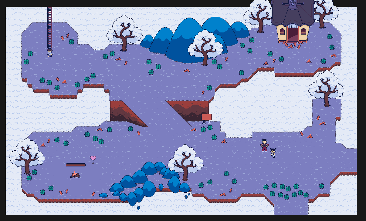
Talking with my brother earlier this week, he mentioned that it’d be cool if the base camp had some more dimension to it. This got me thinking, and I went back and reworked the whole area. There were limitations because cutscenes and object placements were already in hard-coded for the tutorial, but it was possible to work around them.
Here’s the new and improved basecamp- (A zoomed-out screenshot taken from within the gamemaker editor)

The first major change is the cliff and ramp in the centre, which makes the base multistory (which will be important in a moment). Credit to my brother for the great idea, such a small change but it makes the area so much more visually interesting. I spent a long time on the design of the cliffs, trying to find a way of drawing them to match my cartoon art-style was really difficult, but I'm fairly happy with what I landed on. I also filled in some of the blank spaces with some rocks and mountains, reusing the designs from the original Nokia jam version.
The next changes I made became universal changes across all rooms and were also suggestions made by my brother- dirt along the bottom edge of platforms, and diagonal pieces added to the grass tileset. Why hadn’t I already thought of these changes? It seems so obvious in retrospect, but just slipped my mind. Everything is way less flat and square now, and it's made the whole game look way better in my opinion.
--------------------------------------
Base Camp Upgrade:
I’ve felt like the basecamp needed an overhaul for the longest time, but just couldn’t think of a good way to do it without increasing the scope of the game too much. But adding the ramp was enough to get the ball rolling, and it tied nicely into the quest to recruit Yusuke.
The goal of the camp is to have an area of the dream that evolves as you play; Replaying the game you could look back at the junk filled empty area and feel nostalgia for it. So it’s meant to look dank and empty at first.
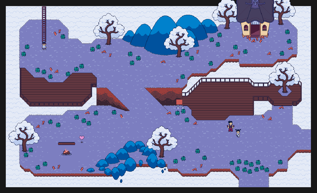
Yusuke’s first quest is to clear the weeds out of camp, and this leads to a follow-up quest- clear out the debris. And just like he uses the leaves you gather, he’ll use the wood you gather to give the basecamp a major overhaul- upper and lower decking expansions.

I’ve had decking expansions in the back of my head for a while but the switch to a multistory base really made the idea click and I got working on it right away.
Finishing this quest will also come with a few more ideas from Yusuke of things to build, but then he tells you he's run out of good ideas and you'll have to find things to build while exploring. This quest also unlocks Yusuke's hammer as a tool, and you can use it to hit certain objects around the overworld to send a schematic back to basecamp for Yusuke to replicate it with the right materials.
--------------------------------------------------------------
World Planning
So far, when adding new areas I just make them functional on their own without thinking of the overall form. After all, it’s a dream so if it doesn’t make perfect sense it doesn’t really matter.
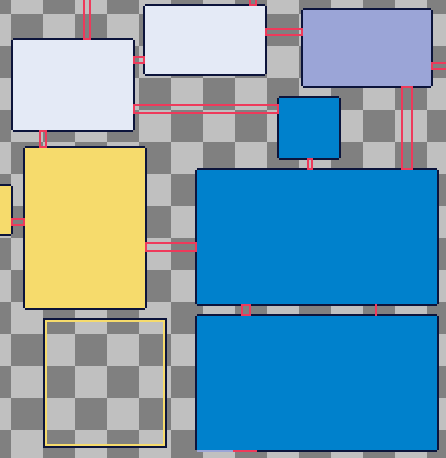
Now that the map is starting to wrap around on itself, I decided I should at the very least make sure that the areas actually connect together properly. Here’s the areas featured in the current demo-

To be clear, this is not a map that will be available for players, it’s purely just for me as a designer. I’m still very committed to making a world that doesn’t need a map to get around, and making sure things line up should help for those keeping a map in their head as they explore.
------------------------------------------
Goals for next week:
None. Tears of the Kingdom is almost here and I’m gonna take a needed break from the project. So no devlog next week, I’ll be back in two weeks time, maybe with some progress made or maybe nothing at all, who knows! Breath of the Wild was a huge inspiration for the open world design of my game and hopefully TotK will be just as inspiring.
Thanks for reading.
Nagayami Nights [Devlogs]
My current project, an RPG inspired by Earthbound and Paper Mario
| Status | In development |
| Author | Yozoraki |
| Genre | Adventure, Role Playing |
| Tags | Anime, earthbound, Exploration, Indie, japan, mother, paper-mario, Pixel Art, Turn-based Strategy |
More posts
- Devlog #47: Sign GhostOct 19, 2023
- Devlog #46: Hedge MazeOct 12, 2023
- Devlog #45: Hype with RhythmOct 06, 2023
- Devlog #44: IndoorsSep 28, 2023
- Devlog #43: Ayumu's HIT (again)Aug 25, 2023
- Devlog #42: Post-Mother DirectAug 17, 2023
- Devlog #41: Pre-Mother DirectJul 27, 2023
- Devlog #40: Skill TreesJul 14, 2023
- Devlog #39: Skip IntroJul 06, 2023
- Devlog #38: Trailer AnnouncementJun 28, 2023
Leave a comment
Log in with itch.io to leave a comment.